|
|
Post by mujinrecca on Dec 23, 2007 3:17:50 GMT -5
|
|
Russell
TRu Member
 Bangalore[M:590]
Posts: 226
|
Post by Russell on Dec 23, 2007 7:04:46 GMT -5
you should properly finish it off first  |
|
.System
TRu Member
In the System[M:-300]
Posts: 241
|
Post by .System on Dec 23, 2007 8:21:24 GMT -5
I see you got the christmas light idea from webaddict
|
|
Russell
TRu Member
Bangalore[M:590]
Posts: 226
|
Post by Russell on Dec 23, 2007 9:08:47 GMT -5
lol well spotted  |
|
.System
TRu Member
In the System[M:-300]
Posts: 241
|
Post by .System on Dec 23, 2007 9:13:15 GMT -5
Maybe get all your text the same level and size looks a bit odd .
|
|
|
|
Post by mujinrecca on Dec 23, 2007 15:21:10 GMT -5
well we pretty much are done, may open tomorrow or today some time!
|
|
|
|
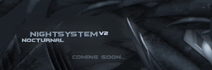
Post by Spike on Dec 23, 2007 16:40:03 GMT -5
well you may want to work on gradients  ....and the snow on the banner is not working...as well as the drop shadow on the title in the banner... would help if i could see the whole site |
|
Mitch
New Member
Formerly Known As Synth-X lol
Posts: 9
|
Post by Mitch on Dec 24, 2007 14:15:12 GMT -5
Nothing special atm. Could do with a lot of work. Gradients are a must.
|
|
|
|
Post by mujinrecca on Dec 25, 2007 13:38:11 GMT -5
WE ARE OPEN!
|
|
|
|
Post by Spike on Dec 26, 2007 0:58:05 GMT -5
looks alright, a border is needed on the head/base if your going to have a forum border on, the christmas theme is nice, well winter as well but winter is coming to an end soon, you started a little late?....redo the font and make it smaller on the head/base images....make it smaller atleast, the info center head image should not be so tall, the base for the info center should also not just be a grad that looks longer then the board because it has no border and is very out of place since all the other base's have a circular edge, as gradients were mentioned, you should make some, right now its to plain and the menu buttons look huge.... as for in the boards: folder icons are nice but look familiar..... not much to the boards...just normal posting fix that userbar....just 1pixel black border not embossed or w.e it is.... On FF the rank images don't blend in to the background well...they also look to big... buttons like reply etc. are just text Too many boards, some board titles should be capitalized and some board names should be spellchecked.... Overall your template looks rushed....let me know if you need any help with designing... |
|
Mitch
New Member
Formerly Known As Synth-X lol
Posts: 9
|
Post by Mitch on Dec 30, 2007 12:03:54 GMT -5
Them header and base images on the boards, just out far too much, and look a bit too big. Add a border colour too.
|
|
|
|
Post by Spike on Dec 30, 2007 20:25:18 GMT -5
^^There remaking the template...
|
|
|
|
Post by Lady Angelique™ on Jan 21, 2008 22:09:26 GMT -5
k am no expert but it looks really good in my eyes..although it looks awfully familiar but who am I to talk...am a newbie...*LOL* But looks good...
|
|